vpi
Web App / UX
team

challenge
redesigning web application for engineers allowing them to graphically present collected data from oil refineries
timeline
4 months
prototypes
paper sketches, wire-frames, user flows, site map
design
simple design – desktop only
VPI is a software dedicated to help oil refineries engineers in their day-to-day work.
At the moment most of them use variety of different programs, each responsible for one particular task. Our goal was to replace them all with one tool that would fit engineers’ needs.
Client
VPI was program created by in-house developer team. It grew overtime – new functions were added, one by one, with out any plan, guided more by what’s needed now or what can be developed quickly. Result was software that did fill all employees needs, but was so chaotic, that new employees struggled with learning it. I was brought in when VPI decided, not only to enhance their employees experience, but also to sell this software to other companies.
Challenges
Understand engineers work flow
Before I could attempt fixing problems I needed to understand what this software is doing, and to do that I needed to understand how engineers work with out it and what exactly they are doing.
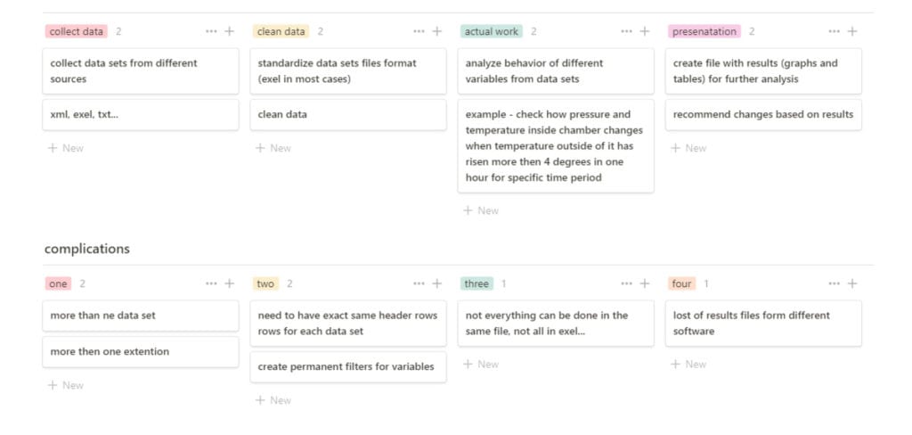
Interviews with oil refineries engineers allowed me to create basic work flow:
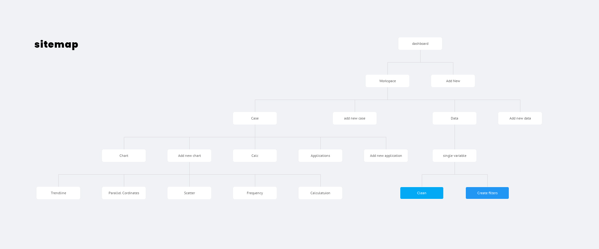
Understand existing software
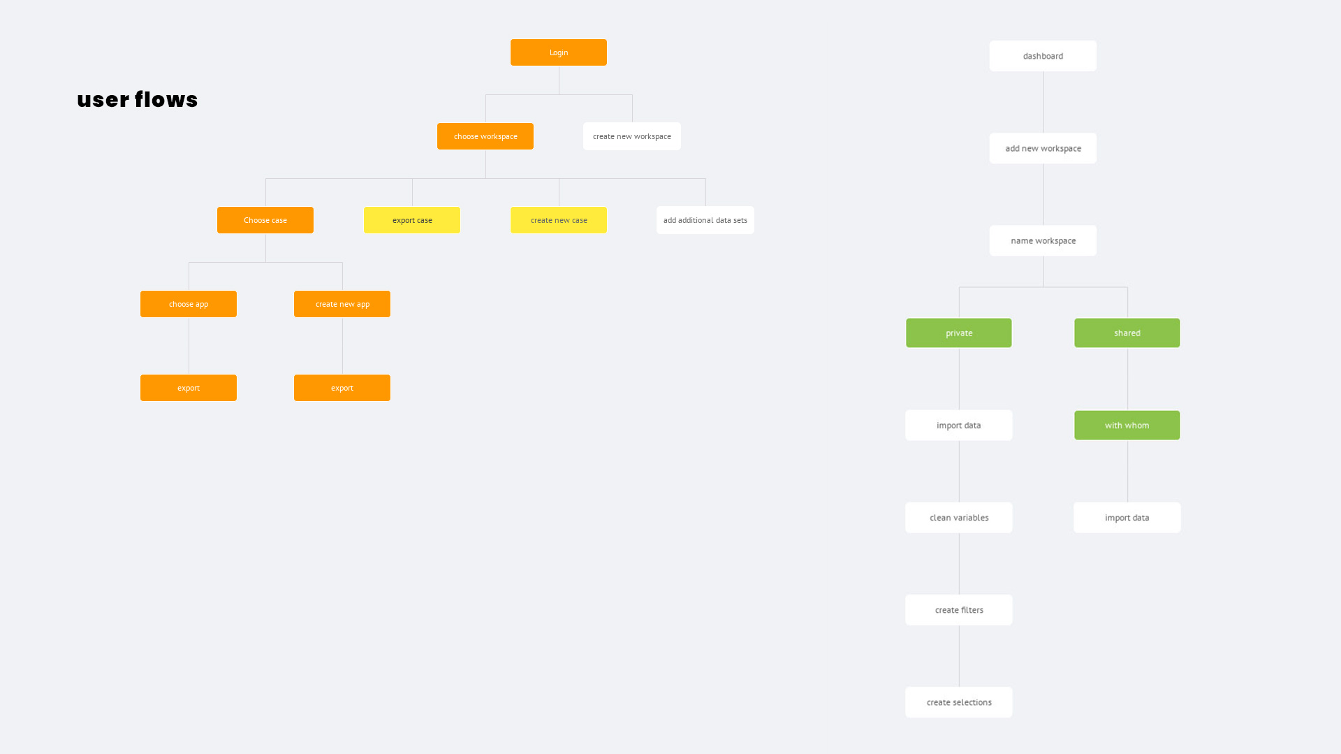
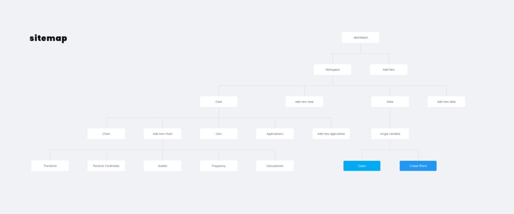
Existing application was chaotic. New buttons were added wherever there was place for them, with out and plan to it. To fix that problem I organized a quick workshop with my client and developers team. Our goal was to organize application architecture and understand basic user flows:

Solutions
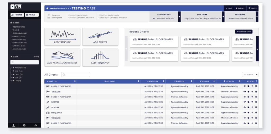
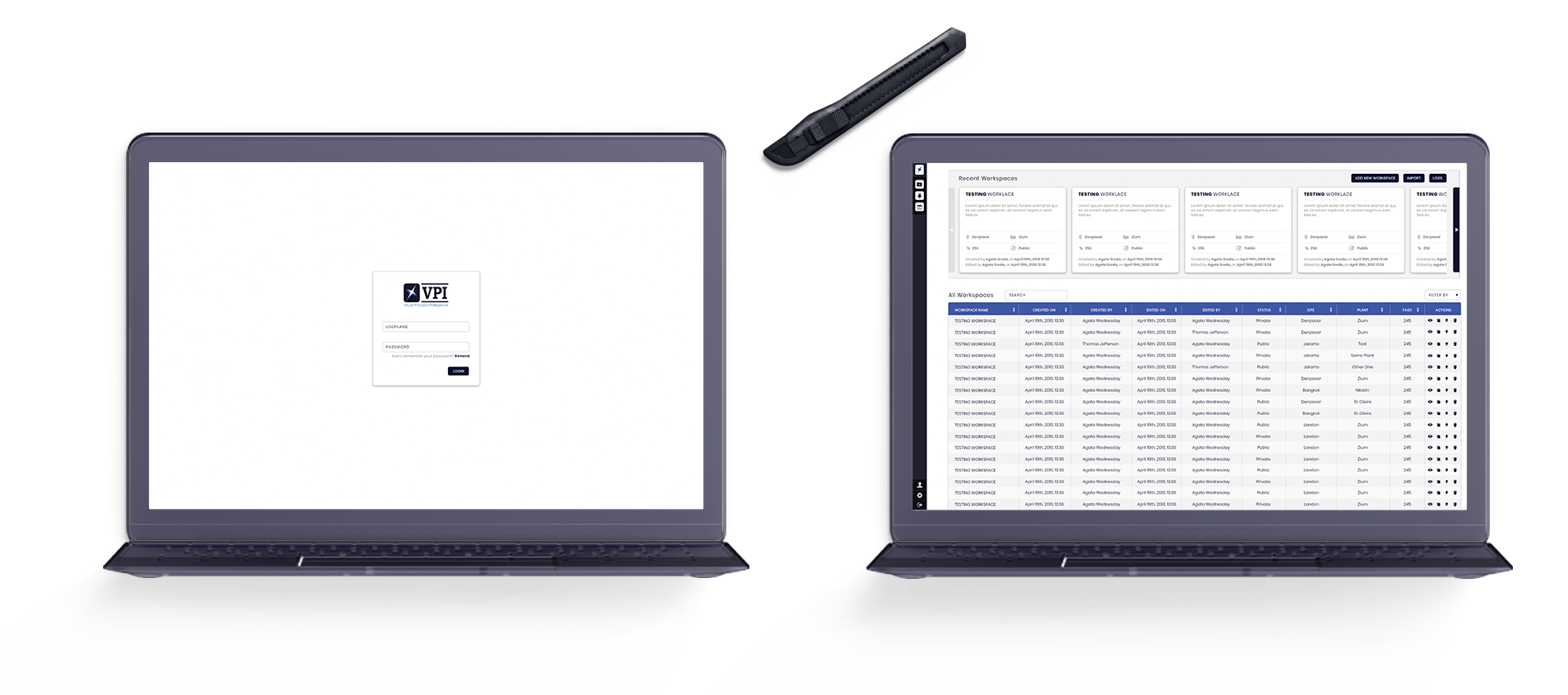
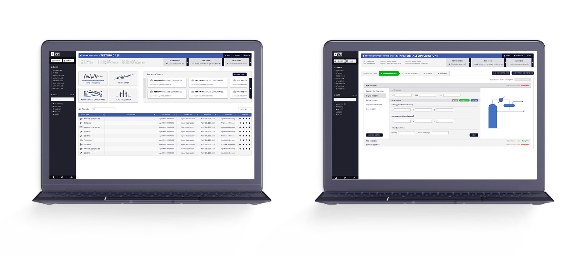
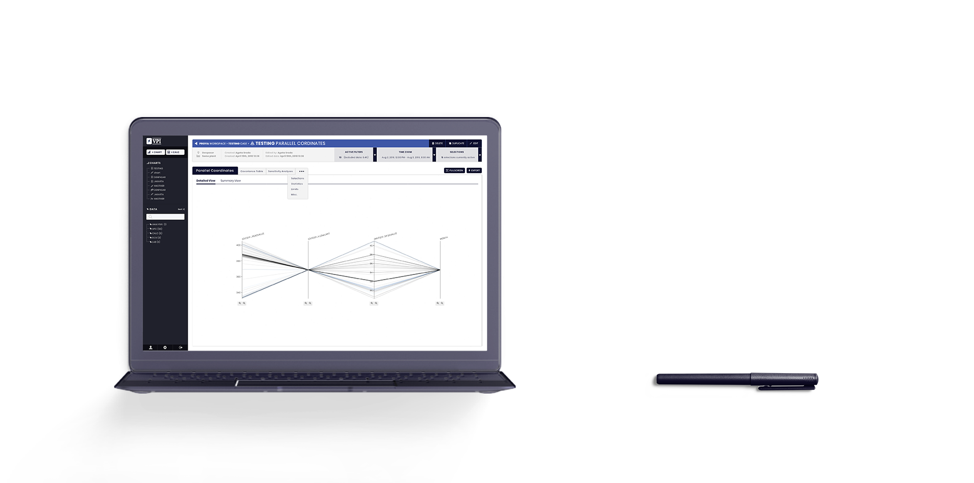
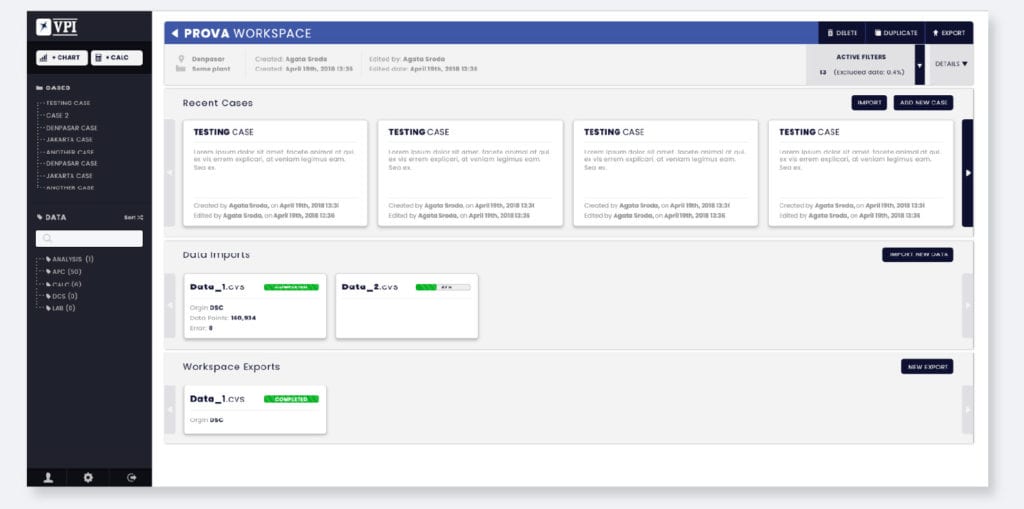
We created simpler clean interface, more adjusted to engineers daily work flow and their needs. New beta version of VPI app combines most common tools for working with large data sets from merging/standardising different file types, through cleaning and sorting variables to automatizing most common analysis.
clean views off all work-spaces
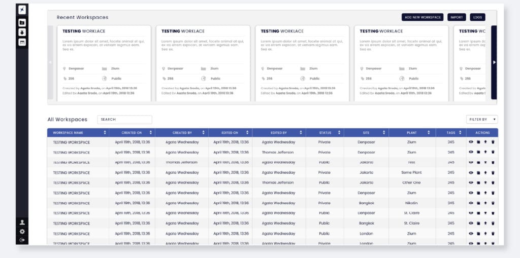
control over data sets and all previous work results
ability to correct variables, without interrupting work flow
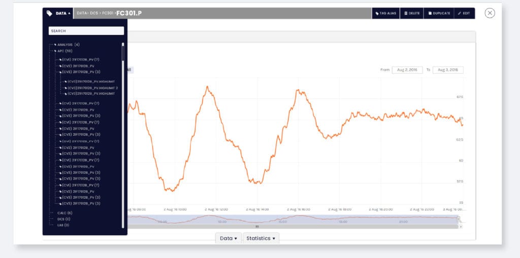
fast access to all analysis tools